#453 Pink and White Flowers

There are some pictures which inspire me to try them just to see what the end result. The original picture had whit flowers. I felt compelled to add a touch of pink. I just think it adds something to the picture. I used a pen to highlight the vase and stems them overplayed soft pastels. The background is a yellow piece of 9 x 12 scrapbooking paper.

#452 The Woman In Red

Today I offer you the woman in red. The painting is done on 9×11 red card stock using some soft pastels and color pencils. The picture I used was a royalty free picture from Unsplash. I really like the way the picture turned out. There are only a couple things I would change.

#451 Orange Pansy

A simple little picture created on an old book page with color pencil and soft pastel. I believe I am turning into a flower artist. I don’t know why it just seems to be happening. I like the idea that each flower is unique and there are many colorful varieties. Well anyway I hope you like my flowers.

#450 The Daisies

This 6 x 9 closeup view of some daisies is done in soft pastel with some highlights of color pencil. I often think this is how God sees us not from far away but up. Lose and personal like these flowers. This makes me realize more how I have to self examine my daily walk so I am a good reflection of God to others.

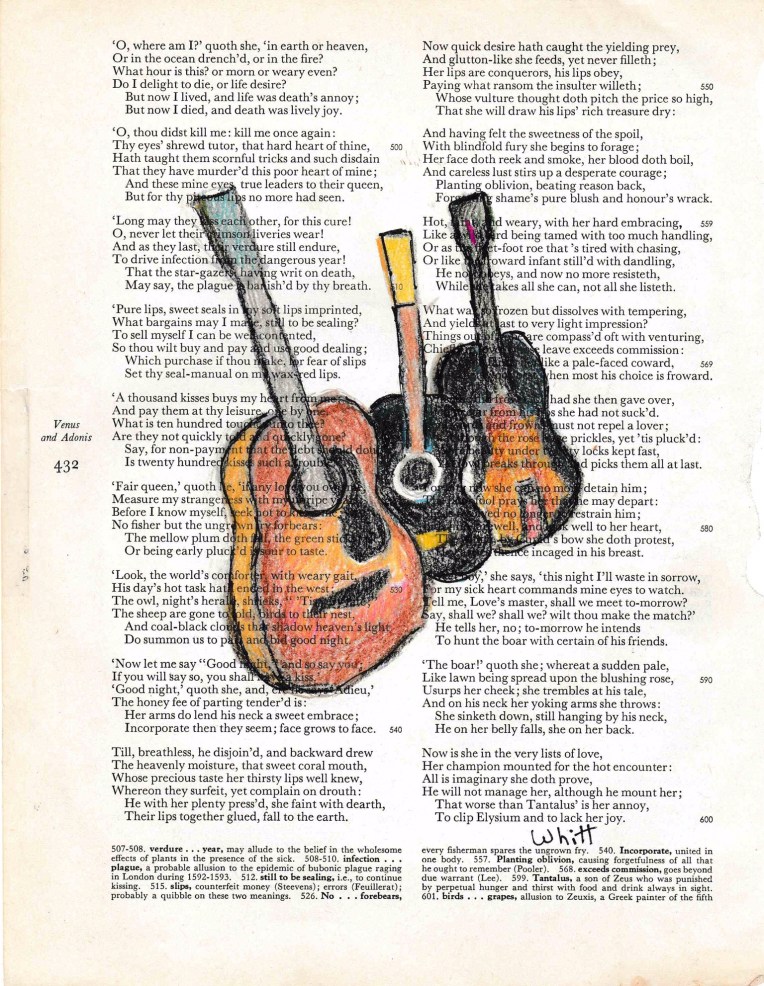
# 449 Guitar Man

A color pencil drawing done on a 9 x 11 old book page. I wanted to add a caption to this one but could not think of one. I will add one later when inspiration kicks in and one pops into my mind. One thing I have discovered in life is that some things come when they come. It is when we get impatient and forge ahead that we get ourselves into trouble.

#448 Pink Flower Up Close

I like to take some subjects and get up close when I paint. It takes something real and gives it an abstract feel. I created this abstract flower using Nu Pastels and some Prismacolor pencils on a 6×9 Strathmore drawing pad. The Bible for many even some Christians the Bible is abstract. This is because we do not take the time to get up close to read and study God’s word.

#447 Little Red Church

Another in my series of churches. This one the Little Red Church is done on a 6 x 9 inch Strathmore drawing pad in soft pastels and color pencils. I like creating scenes with small church because they remind me that the church is much more than a building it is the people inside the building leaving through the doors in order to do God’s work in the world.

#446 Walking Through Fields of Gold

I really like the contrast of the colors in this picture. One of ,y favorite artists is VanGogh. I love the way he used shorts Burt’s if color to create a whole picture.i strived for a little of that here. I don’t know if I really succeeded or not. Oh well you know what they say, “If at first you don’t succeed try, try again.” or put another way practice makes you better. God does not want us to be quitters. He want us to run the race set before us until we reach the finish line.

#445 Little House on the Hill

I used to love to draw landscapes. Then I stopped. I started to focus on not her for self art. Only recently have I returned to my landscape roots. This offering, “House On The Hill,” was created on a 6 x 9 piece of Strathmore drawing paper using soft pastels and Prisma color pencils. Life to me is sometimes like this picture we ha e habits we try to stop but sooner or later we return to them. It is only through the power of Jesus, God and the Holy Spirit that we can truly be free. The key however is to trust which means letting go and focusing on God.